
Keywords
How to Cite
Abstract
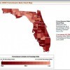
The work of Extension professionals is often to translate complex research findings into practical recommendations. One of the tools used for communicating with Extension audiences is visual representation of data. These visualizations include graphs, charts, and data overlaid onto maps. Just as text and words must be thoughtfully prepared for broad understanding, images should be adapted from the forms used with highly knowledgeable audiences. This 6-page fact sheet summarizes research in science communication and education that offers strategic ways for communicators to revise data visualizations for broad meaning-making. Written by Kathryn Stofer and published by the UF Department of Agricultural Education and Communication, May 2014.
AEC499/WC163: Visualizing Spatially Based Data for Various Stakeholder Audiences (ufl.edu)
References
Boulton, M. (2010). Hue, saturation and brightness. Designing for the Web. http://designingfortheweb.co.uk/book/part4/part4_chapter17.php
Faughn, J. S., & Serway, R. A. (2003). College Physics (6th ed.). Canada: Thomson, Brooks/Cole.
Harrower, M., & Brewer, C. A. (2011). ColorBrewer.org: An online tool for selecting colour schemes for maps. In The Map Reader (pp. 261-268). John Wiley & Sons, Ltd. http://dx.doi.org/10.1002/9780470979587.ch34 https://doi.org/10.1002/9780470979587.ch34
Lagrosa, J., & Demers, C. (2012). Introduction to Geographic Information Systems. Gainesville: University of Florida Institute of Food and Agricultural Sciences. http://edis.ifas.ufl.edu/fr356 https://doi.org/10.32473/edis-fr356-2012
Light, A., & Bartlein, P. J. (2004). "The end of the rainbow? Color schemes for improved data graphics." EOS Transactions of the American Geophysical Union, 85(40): 385-391. https://doi.org/10.1029/2004EO400002
Moreland, K. (2009). "Diverging color maps for scientific visualization." In G. Bebis, R. Boyle, B. Parvin, D. Koracin, Y. Kuno, J. Wang, D. Coming (Eds.), Advances in Visual Computing (Vol. 5876, pp. 92-103). Berlin, Heidelberg: Springer Berlin Heidelberg. http://www.springerlink.com/index/10.1007/978-3-642-10520-3_9 https://doi.org/10.1007/978-3-642-10520-3_9
National Science Board. (2012). Science and Engineering Indicators 2012. Arlington, VA: National Science Foundation (NSB 12-01). Retrieved from http://www.nsf.gov/statistics/seind12/pdf/seind12.pdf
Rowe, S. M., Stofer, K., Barthel, C., & Hunter, N. (2010). Hatfield Marine Science Center Magic Planet Installation Evaluation Findings. Corvallis, OR: Oregon Sea Grant.
Stofer, K. A. (2013). Visualizers, Visualizations, and Visualizees: Differences in Meaning-Making by Scientific Experts and Novices from Global Visualizations of Ocean Data. Unpublished Doctoral Dissertation. Oregon State University, Corvallis, OR.
Telg, R. (2013). Visual Communication. Gainesville: UF/IFAS. http://edis.ifas.ufl.edu/wc101